Adding delight to the most valuable
Interactions of MetaMask
MetaMask is one of the world's most used crypto wallets. I joined through the Consensys acquisition of Web3Auth, and what came next was not a clean handover with a clear brief. It was something much more interesting than that.
- Role
- Senior Interaction Designer
- Timeline
- 2025 — 2026
- Team
- Product Design, Branding
Where I came in
At Web3Auth I was one of three designers. Between us we owned everything. Branding, design system, illustrations, motion, marketing, print, digital interactions in the app and on the website. Big chunks of responsibility shared across a very small team.
MetaMask was the opposite. Part of Consensys, a company of over two hundred people, with separate branding, product, and marketing design teams each with their own directors, PMs, and contributors. I was brought in through the acquisition and placed within the product design team, but the reality was that I didn't fit neatly into any single team. Everything I was good at was already owned by someone else.
So I sat down with the VP of Design and we started working through ideas together. That conversation eventually pointed us in a clear direction. My job was to bring delight to the MetaMask app. Own the interaction layer. Make the product feel alive.
Spotting the gap
MetaMask is a financial product and it carried itself like one. Serious, functional, and not particularly warm. That made sense up to a point, but it was also creating friction with a growing audience of everyday users who found the product intimidating.
The signal was coming from multiple places. User testing sessions, Twitter interactions, and in-person conversations at events all pointed to the same thing. The product worked but it didn't feel good to use. There was a gap between what MetaMask needed to be functionally and what it could feel like emotionally, and that gap was an opportunity.
I brought this to the marketing and research teams to validate the idea and start identifying where the real moments were. Where were users dropping off. Where were they waiting. Where were they making decisions that needed a bit more confidence and warmth to feel right. These became the foundation for everything that followed.
Building the system before building the work
The first tool I looked at was Lottie, which the team was already using for some animations. The problem was file sizes were too large for mobile and the workflow between design and engineering was clunky. I started evaluating Rive as an alternative and it was a much better fit for what we needed.
Introducing Rive to a large engineering team was not just a tool switch. It took real work. We ran naming convention sessions with the front end developers to make sure files were handed off cleanly. We tested and fine tuned the implementation process end to end. We built documentation for handovers so engineers knew exactly what to expect from every file.
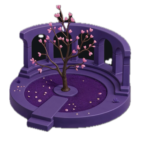
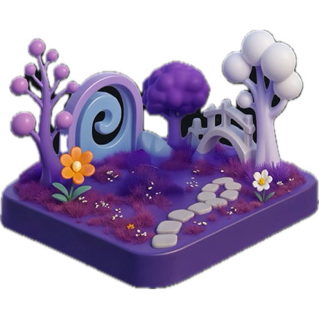
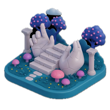
The branding team was more than welcoming through all of this. They jumped in, helped generate in-app assets, and contributed to building a 3D asset library that became part of the motion system. What started as my initiative became a shared practice across teams.
By the six month mark Rive was embedded in the workflow and I had built a component library of animated assets that anyone on the team could pull from and use without coming to ask me.
What I worked on
Once the foundation was in place I started building. The Fox splash screen that every user sees when they open the app. The pull-to-refresh animation. Onboarding flow interactions. Login flow transitions. Rewards level intro animations. Icon interactions. Loader states and Fox expressions that gave the product warmth and character in moments where users are waiting or moving between states.
Each of these started as a Rive file, iterated on in the tool, and exported for engineering implementation.

The motion guidelines and building with AI
As the work matured I started thinking about the next problem. The design team was beginning to use AI tools like Figma Make and Replit to generate new screens and flows quickly for testing and validation. The issue was that these generated screens felt rough compared to the real product, which introduced prototype bias in testing. Users were reacting to the fidelity of the prototype rather than the idea being tested.
Working with the VP of Design I developed a motion and interaction guidelines document and turned it into a markdown file that any designer could reference while generating screens with AI tools. It covered timing, easing curves, transition types, and the specific interaction patterns we had established for MetaMask.
The result was that AI generated prototypes started feeling much closer to production quality. Testing became more reliable because users were responding to the design decisions rather than the rough edges of the prototype. Ideas could be validated faster and with more confidence.
What it added up to
In the space of a year, working closely with the VP of Design mostly as a individual contributor, MetaMask had a motion practice it didn't have before. Rive replaced Lottie as the primary tool for in-app animation. The branding team had a shared 3D asset library. The design team had motion guidelines that made AI-assisted prototyping significantly more accurate. And the product had a set of moments, the Fox, the loaders, the transitions, that felt human in a way crypto products rarely do.